
Tiny Twice
A platform that helps parents buy and sell children’s clothes with trust and ease.
MOBILE APP
ROLE : UI/UX DESIGNER
TIMELINE : 1.5 MONTHS (2025)


Project Overview
Tiny Twice is a platform for buying and selling children’s clothing with ease, hygiene and trust. It simplifies the process for parents and loved ones through thoughtful pricing, a guided listing journey, and answers to common concerns. This case study reflects the design thinking behind creating a resale experience grounded in a user- centered approach.
Design Process

RESEARCH AND USER STUDY
I have a challenge, how do I approach it ?
-
Secondary Research
-
User Interviews

IDENTIFYING PAIN POINTS
I learnt something, how do I interpret it ?
-
Empathy Mapping
-
User Persona
-
User Stories
-
Problem Statement
-
Competitive Audit

IDEATING SOLUTIONS
I see an opportunity, what do I create?
-
User Journey Mapping : Buyer & Seller
-
HMWs
-
Brainstorming

WIREFRAMING & VISUAL DESIGN
I have an idea, how do I build it ?
-
Information Architecture
-
Visual Identity
-
Paper Wireframes
-
Digital Wireframes
Tiny clothes, Big Problem !
MILLION
Children in the age group of 0-5 yrs in India
There are

1
9
on children's clothing (p.a.)
Parents are willing to spend
₹24,000 -
₹36,000


Garment Lifespan
(according to age groups)
*These numbers reveal a clear gap in how children’s clothing is bought, used, and outgrown—one that needs better and lasting solutions.*
How Might We ? (HMW)
How might we make buying and reselling children’s clothing easier and more reassuring for the users ?
How might we remove hesitation around pre-loved clothing by creating a thoughtful, trustworthy and delightful resale experience?
How might we address concerns around hygiene, trust, and pricing to build confidence in second-hand choices ?
Problem
1. Hygiene Concerns
Parents hesitate to buy pre-used clothes due to doubts around cleanliness and fabric condition.
2. Unclear Pricing
Buyers and sellers struggle to estimate a fair price, leading to overpaying or underpricing.
3. Unclear Photos & missing details
Make second-hand listings feel unappealing and untrustworthy, giving buyers a poor experience.
4. Social Stigma around resale
Buying second-hand is often seen as unhygienic or financially inadequate.
Solution
1. Aftercare Service
Every order is professionally sanitizsed and safely packed before reaching the buyer, ensuring hygiene and trust.
2. Smart Pricing Tool
A scan-based AI system suggests price ranges based on product condition, category, and brand.
3. Make Listings look reliable
After taking a photo, pick a nice preset background making the product look more presentable boosting buyer trust
4. Culture of care and trust
The platform builds trust by focusing on care, value, and hygiene, normalising thoughtful resale.
Key Features

Clean up your clicks
Background Remover - Instantly remove or change photo backgrounds
Switch Modes, Stay Clear
Buyer/Seller Modes - Simplified screens tailored to your current role


Partner Mode — Browse and decide together with your partner or co-parent
Shop Together, Seamlessly
We've Got You Post-Sale
Aftercare Service : Hassle-free sanitation & packaging service after the purchase


Smart Pricing Suggestions
AI Cost Calculator — Get help setting a fair resale price instantly

Smart Sizing with AR
Click a photo, and get the product’s size auto-filled no manual measuring.
Information Architecture

Login/
Signup
Buy
Sell
Buy
Sell

Paper
Wireframes
Swipe to view the Buyer and Seller paper wireframes >
Brand Identity
Tiny Twice is a kids’ app, but used by parents and gifters -adults with busy lives. So the design had to be thoughtful and practical, while keeping a playful, childlike touch.
This core idea shaped the entire UI & UX, from identity to experience, the goal was to keep it simple, intuitive, and warm, something comforting and effortless for busy adults.
/Logo
The name Tiny Twice captures the heart of the idea :
Tiny clothes getting a second life

TWICE
TINY
Pieces of a shared journey !
The jigsaw puzzle reflects how every pre-loved garment carries a piece of someone’s story—when passed on, it completes another’s.
It’s all part of a shared journey !
/Colours
I chose vibrant colours to keep the interface full of life. Blue brings trust and calm; yellow adds warmth and cheer

I used this contrast to colour-code buyer and seller modes, creating clear visual distinction and making navigation simpler, less cluttered


/Typography

CHELSEA MARKET
Regular
Chelsea Market appears in headings and select spots to bring out a playful, childlike tone.
Nunito is clean and rounded, keeps the UI friendly and easy to read.

NUNITO
Regular (Italics) | Semibold (Italics) | Bold (Italics)

/Onboarding


A short onboarding flow helps users (busy parents) get started quickly without it feeling like a task.
Choosing buyer or seller modes early keeps things clear and organised, making the app easier to navigate.
/Buyer Mode

Chat & discuss with your partner, mom, friend or anyone you usually shop with right in the app.


A quick guide to help first-time users, with a cancel button for those who prefer to dive right in.
For buyers seeking clarity, more details like listings, & chat or review options build trust and ease decisions.

Seller Rating to instill confidence among buyers
Among other key details, sizing and seller ratings are highlighted upfront, helping parents make quicker & confident choices .
You can message the seller to clear doubts anytime.
Success stats that build trust.
‘Shop by Brand’ option taps into users’ trust in familiar brand names, making them more inclined to explore and purchase.
/Seller Mode


‘Photo Tips’ offer extra help if needed.
The recent listings section ensures quick access to
what user has added, making it easy to track sales, edit listings, or manage orders
Save Progress helps busy parents pick up right where they left off, no pressure to finish in one go
Aftercare reminder is shown upfront, so users don’t miss it.
Slots like front view and closeup guide uploads, helping users know what to add.


Background templates
eliminate setup stress and save time while keeping listings looking good
Quick Tips placed right below to guide first-time users
Putting video guide beside main button prevents
users from quitting
when they're confused
Edit Dimensions and Retake Image to quickly fix any human or
technical errors
Collapsible help sections at the top ensure guidance is accessible without cluttering the pricing experience


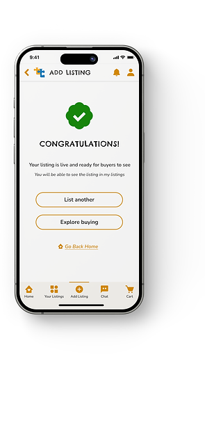
Clear confirmation message celebrates achievement while showing available next steps.
Fixed / negotiable lets sellers choose their preferred style of negotiation
2 secondary CTAs with because both actions drive user engagement and platform growth.