
Step Up,
Step Down
A simple visual guide to help first time users feel at ease stepping on and off escalators.
INSTRUCTIONAL GUIDE
ROLE : UX DESIGNER | INFORMATION DESIGNER
TIMELINE : 2 WEEKS (2025)
Project Overview
Escalators are everywhere — malls, metro stations, airports, railway stations, and public buildings. But not everyone feels confident using them. For many, just stepping onto a moving staircase can feel confusing or intimidating. That hesitation, whether it’s about stepping on, riding, or getting off has a name: ESCALAPHOBIA
This project explores that fear and turns it into
a simple, instructional guide — designed to make escalator use feel easier, more approachable, and a little less stressful for everyone.


Understanding the Users
After years of noticing people struggle with escalators, I wanted to understand why. So, I observed users at malls and railway stations, and even watched videos to get a wider perspective. Certain groups stood out — children, older adults, and first-time users often looked confused, unsure, or even embarrassed while trying to use them.
Users in wheelchairs or with visual impairments faced bigger challenges, often needing help from others.

Understanding User's Concerns
Limited experience of using the escalator
Not knowing where and when to step on
Shy or embarrassed to ask for help
Feel rushed by others, causing panic
Children might not be able to reach the handrail for support
Fear of falling and tripping
Skeptical of technology, hesitant to try
Difficulty in timing the stop
Feeling shy and intimidated in a different/ hostile environment
Limited strength and coordination in older users makes trial-and-error difficult
User's Current Approach

1. Ask for help

2. Watch and learn

3. Trial and Error

4. Use other options
Common User Mistakes

1. Stepping on the
yellow lines

2. Not lifting long/
flowy clothing

3. Panicking while
stepping off

4. Poor posture, sitting, or trying unusual positions
Points to Consider while designing the guide
Use clear, simple words and short sentences.
The guide should feel friendly and reassuring to users.
Use bold graphics and high-contrast colours for better visibility.
Focus more on visuals than text to help users who may not read either language.
Make the guide quick to scan, so users don’t feel like they’re slowing others down.

User
Guides

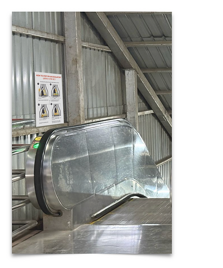
Height upto the handrail : 40”
Size of the User Guide : 20” x 14”


Height upto the handrail : 40”
Size of the User Guide : 20” x 14”

